
Responsive Web Design Principles for Any Device

As technology evolves, people now access websites from a variety of devices, including smartphones, tablets, and desktops. To ensure a smooth and consistent experience across all these platforms, Responsive Web Design (RWD) has become a vital approach for web designers. This design approach allows websites to adapt to different screen sizes and resolutions, offering an optimal viewing experience. In this article, we will explore the core principles of Responsive Web Design that every web designer should follow.
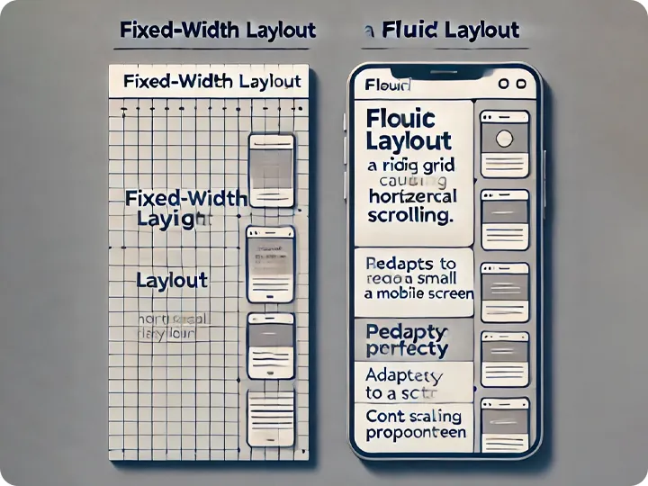
1. Fluid Layouts
Fluid layouts form the foundation of Responsive Web Design. Unlike fixed-width layouts, which use specific pixel values, fluid layouts rely on flexible grids. These grids adjust according to the screen size, allowing elements to scale proportionally.
For example, on smaller devices, the content fits perfectly without causing horizontal scrolling. On larger screens, the design expands to use the extra space. This flexibility ensures a smooth and immersive experience for all users.
2. Responsive Web Design with Media Queries
Media queries are key to Responsive Web Design. They enable designers to apply different styles based on factors like screen width, resolution, and orientation. By using media queries, designers create breakpoints where the layout changes to suit the device.
For instance, a design might appear differently on a tablet and a desktop. Responsive Web Design ensures that users can navigate the site easily, regardless of their device.
3. Responsive Images
Images play a crucial role in Responsive Web Design, but they can slow down load times on mobile devices. To improve this, responsive techniques adjust image sizes according to the screen. Smaller images appear on mobile devices, while larger ones are displayed on desktops.
This optimization improves load times and ensures better performance across all devices, making the website faster and more user-friendly.
4. Mobile-First Design
A mobile-first approach is essential in Responsive Web Design. With the rise in mobile device usage, designers should prioritize optimizing websites for smartphones. After ensuring the mobile version works well, they can enhance the design for larger screens like tablets and desktops.
The mobile-first approach emphasizes simplicity. Designers focus on the essentials for mobile users and gradually add more features as screen sizes increase. This ensures an efficient and streamlined user experience. For further insights on mobile-first design, visit Smashing Magazine

5. Responsive Web Design: Typography and Readability
Typography is vital in Responsive Web Design. On small screens, text can be hard to read if it’s too small. To improve readability, use relative units such as em or rem instead of fixed pixel sizes. This allows the text to scale properly on different devices.
Line spacing and paragraph spacing should also be adjusted. These changes ensure that text remains legible on any device, from mobile phones to desktops.
6. Navigation for Touchscreens
Navigation plays a significant role in Responsive Web Design, especially on mobile devices. Users interact with websites through touch gestures, so menus must be easy to navigate on smaller screens. Buttons should be large enough for easy tapping, and spacing should prevent accidental clicks.
Simplified or collapsible navigation menus, like hamburger menus, often work well in mobile-first designs. This approach makes it easier for users to find and access the content they need.

7. Testing and Optimization
Testing is crucial once the Responsive Web Design is complete. Designers must check how the website appears on various devices to identify any layout or performance issues. Testing tools can simulate how a site looks on different screens, allowing designers to make necessary adjustments.
Website optimization is also essential. Compressing images, minimizing code, and using caching techniques help improve load times, especially on mobile devices with slower connections. Optimizing your site enhances performance and ensures a smooth experience across devices. For more details on website performance optimization, visit Google’s PageSpeed Insights.
Additionally, web designers should be aware of common design mistakes that can hinder the user experience. For tips on how to avoid these pitfalls, check out our article on Top Mistakes in Web Design and How to Avoid Them.
Ensuring Optimal User Experience with Responsive Web Design
Responsive Web Design is crucial in today’s mobile-first world. By implementing fluid layouts, media queries, mobile-first design, responsive images, and readable typography, you can create websites that adapt perfectly to any device. These principles ensure that your website is both visually appealing and functional, providing users with an excellent experience, regardless of the device they use.